
Thinking Visually: Graphic Tips for Technical Presentations
Here’s how to produce slides, computer screen shows, transparencies,and posters for technical presentations
In an age of information overload, how can professionals communicate effectively and efficiently to technical audiences? How can we organize our technical presentations to achieve our goals?
But what is effective, good communication? We define communication as the sharing of meaning, so that both the audience and the presenter have similar perceptions about the content. This means that the presenter has to plan, design, implement, practice, and present the technical information, including the followup—how did it go, what questions did people have?
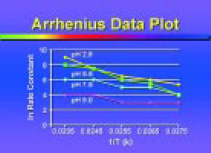
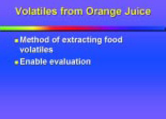
Good design includes structured layout, organized objectives, and sharp graphics, as opposed to chaotic layout, rambling objectives, and overloaded graphics. Figs. 1 and 2 both present the same information, but Fig. 1 is presented in a way that hinders communication.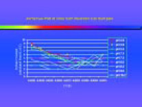
 Overhead transparencies, 35-mm slides, computer screen shows, and posters are four main examples of visual communication. We assume that you know the technical content and have a way to present your ideas, the literature review, methods, results, discussion, and key references. But how do you visualize it? How do you start thinking visually?
Here are six ideas for thinking visually:
1. Print is not projection. Design or redesign your information for your intended output. How are the design and layout different for presentations and for publications?
2. Limit your major points. Focus on your primary ideas. What are the major points? What is my primary text?
3. Think visually. What graphs, tables, drawings, or photographs can I use to illustrate my points?
4. Think influence. Color can be used to emphasize, highlight, and organize. How can I use color to do this?
5. Think beyond the box. What else can I do to get my point across? Where else can I use this presentation?
6. Use basic design ideas to guide your visuals—layout, text, color, graphics, and tables.
Layout
Good layout requires consideration of page dimensions, orientation of visuals, use of templates, consistency, size and number of elements, and use of “white space.”
Page Dimensions
Page dimensions of the four visual media all vary. Know your intended output so your layout is correct and information isn’t cut off the edges when you present (Fig. 3).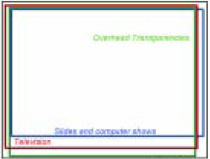
Orientation of Visual
Set your computer screen show or 35-mm slide show in a horizontal (landscape) orientation. Projection screens are oriented as horizontal. Computer slide shows are usually already set up for a horizontal orientation as default.
Transparencies can be either horizontal or vertical. Just make sure that the visuals fit on the projection screen you use (Fig. 4).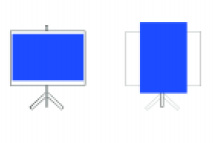
--- PAGE BREAK ---
Use of Templates
Computer design programs like Microsoft PowerPoint or Lotus Freelance allow the use of one template per file. A template is a file that has been set up with a “look” for your presentation. The template is predesigned with a color scheme, font specifications, and page layout. You just need to add your information. Use one template design throughout a technical talk. This helps the audience quickly become familiar with the layout after a few slides.
Consistency
Decide what typeface, type size, colors, graphics, background design, and layout to use for your entire presentation. While you can use some variation, strive for consistency. The audience learns to read your slides—where the title will be, what a certain color represents, etc.—and understands the information faster.
Size and Number of Elements
Overall, a limited number of elements, big graphics, and big text make reading easier. Less is more, and big is beautiful. Figs. 5 and 6 present the same basic information, but Fig. 6 communicates faster.
 Use of White Space
Blank areas in a visual or on a page help the reader through the data and avoid the appearance of overcrowding.
Text
Key points to consider regarding text are the amount of information to be presented, key words, ease of reading, and sequencing.
Amount of Information
Limit the amount of information in the presentation. Visuals should have:
· One main point.
· One thought per line.
· No more than 5–7 words per line.
· No more than 5–7 lines per visual.
Key Words
Use key words, ideas, and concepts:
· Have uncluttered visuals.
· Show key words, not complete sentences or paragraphs.
· Each visual should be a hint, not the whole story.
--- PAGE BREAK ---
Ease of Reading
Type should be easy to make out and comprehend:
· Fine or thin lines may disappear when projected. Text needs to be heavy (bold) enough to provide good contrast to the background.
· Avoid fonts that are too bold. The type may run together, making it difficult to read.
· Use no more than 2–3 typefaces and styles (bold, italic, etc.) per presentation.
· Change type sizes or vary type color to distinguish differences.
· Use large text sizes. Text should be large enough to read without effort. For most presentation media, titles should be 36- to 48-point and text should be 24- to 36-point for computer screen shows and 35-mm slides. For video, text should be a minimum of 30-point. For posters, text should be a minimum of 24-point for the body, and 72-point for the title.
· Different fonts may have the same point size but can vary in line length (Fig. 7). 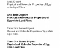
· Use a combination of uppercase and lowercase lettering. Using all capital letters is harder to read because words formed with capital letters are repetitious rectangles that offer few distinctive shapes to catch the reader’s eye (Fig. 8). 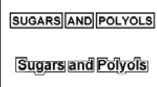
· Use italics, change text size, vary style, or alter color instead of underlining words for emphasis. Underlining interferes with the descenders of the letters and reduces the distinctness of the shape of the words, making the words harder to read.
· Bullets should be easy to see (Fig.9). Check for their size and color.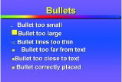
· Keep similar text the same size from one visual to the next. For example, changing the title size may make some information appear more important and confuse the viewer.
· Minimize punctuation in visuals. Avoid commas, semicolons, or periods. Ideas should already be grouped and arranged visually with bullets or numbers. The formatting size, type style and weight, position, and color should reveal the structure of the material.
· Generally, start all sections with a capital; from there on, all words should be lowercase. The title can be upper- and lowercase and bold, or all uppercase, though this is somewhat more difficult to read.
· Proofread visuals. Then have someone else proofread them for you.
· Place the most important text at the top and in the brightest color. Arrange the material in a pattern related to how people read—left to right, top to bottom. Leave a larger margin at the bottom of the visual for material that is to be projected on a screen. This allows for extra room in case there are heads, tables, or chairs in the way of the projector.
· Use text-justification commands to align text rather than using the tab keys or space bar. Tab keys and space bar may make the text appear to be aligned on your computer screen, but the text won’t be aligned on your output.
--- PAGE BREAK ---
Sequencing
Use the animation features in computer software to reveal your information, one line at a time, in a series of slides or overheads (Figs. 10–12).


Color
Color can:
· Explain or emphasize a single point.
· Make emphasized elements more vivid by highlighting key words.
· Prioritize information or focus attention on important features.
· Make new points stand out by distinguishing special elements in graphs or tables.
· Identify a recurring theme and speed comprehension.
· Sort materials using color repetition.
Key considerations are visibility, differentiation, and color combinations:
Visibility
Color must be seen when superimposed on a background of another color. Foreground and background elements must have enough contrast between them. Inappropriate colors interfere with legibility, and too many colors can distract from the message.
· For slides and computer screen shows, use dark blues, darker grays, dark greens, and black for the backgrounds. Generally, use yellows and white for the text and graphics; they are considered the best colors for visibility, since they provide good contrast against dark backgrounds.
· For overhead transparencies, use very light yellow or blue for the background and dark colors for text and graphics.
Differentiation
Use color to differentiate, accent, group, emphasize, prioritize, and identify recurring themes or a particular word or graph.
· Use the brightest color on the information you want to feature, since the audience will look at the brightest area first.
· Emphasize no more than two elements in a frame.
· Don’t use competing bright colors.
· Black has the maximum contrast against white and is the easiest to read. If you want an equivalent effect from color, you have to increase the size of the color-carrying elements to compensate for the decreased contrast. The closer the contrast is to the contrast between black and white, the less you have to increase the size of the text or graphic for it to be readily visible; i.e., use light background and dark text.
· Color-coded titles, bullets, graphics, or text can speed up interpretation of the data. The color helps provide a location map for the viewer. In turn, the viewer is directed to the information by the colors rather than having to search.
· Don’t use color just because you have it. Too much color weakens its impact (Fig. 13).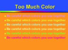
--- PAGE BREAK ---
Combinations
· Don’t use too many colors or too many shades of one color.
· Keep graduated backgrounds subtle and smooth.
· Be careful which colors you use together. Very bright colors scream at your audience and tire their eyes. Some colors will “vibrate” against each other and make the visual too difficult to read; they make the visual look blurry.
· Do not use blue on black (Fig. 14). It looks out of focus.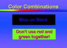
· Do not use red and green together (Fig. 14). Studies show that 7–9% of males and 1–2% of females are color deficient, which means they don’t see all colors. Red and orange are confused with green and yellow. If your visual is green with red text, some individuals would see only one color with each slide.
· Keep a consistent color scheme throughout your presentation. Consistent graphic elements should be linked from frame to frame. Titles should be the same color, similar data variables should be the same color, bullets should be the same color, and so forth.
· Different media project color differently. Film recorders, printers, video equipment, and computer monitors interpret colors and show them differently. Consequently, there may be a vast difference between the colors on your computer screen and those on your output device. Also, everyone sees colors differently. If color accuracy is critical, make test visuals and consult with those who will be imaging your slides or printing your poster.
Graphs and Tables
Most technical presentations provide insights and promote discussions; they are not forums for dissecting raw data. Graphs and tables are the best way to summarize large quantities of raw data. Because of its visual nature, graphical information becomes memorable. However, complicated visual data cause undesirable impressions (the presenter cannot interpret his or her own data, is a disorganized person, or is being inconsiderate by talking down to the audience).
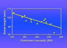
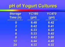
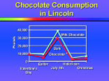
It is usual for the same data to be used in a journal article, a slide show, and a poster show. However, each presentation type has different requirements. Design the graph for the type of presentation for which it will be used. Graphs prepared for publication (where readers can linger over the data) are not ideal for slides or posters (where viewers get only a glimpse of the image). Figs. 15 and 16 present the same information, but clearly Fig. 16 is better than the other for use in an oral presentation.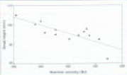
 Getting Started with Graphs and Tables
· Simplify the data.
· Show only the essential information needed to get the point across.
· Don’t put up an entire complicated chart or graph.
· Streamline the visual so it can be read quickly.
· Use only essential and functional line-work in the graphic to orient the viewer.
· If you do have to show a complicated graph, provide a handout so the audience can follow along.
--- PAGE BREAK ---
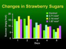
Figs. 17 and 18 show the same data, but Fig. 18 is better suited for slide presentation.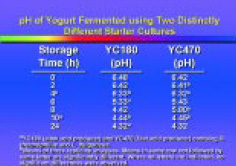
 · Be consistent in style and terminology.
· Be consistent in label size, font, type style, line width, colors, symbols, and layout.
Elements of the Graph
· The most important data should be depicted with the brightest color.
· Data elements (bars, lines) should be the thickest and the brightest colors. Frames, axis lines, ticks, and error bars should always be distinctly lighter in color and weight than the lines that actually represent the data lines and points in line graphs, bar boxes in bar charts, and arrows.
· Grid lines should be light and thin.
· Make sure that grid lines are behind data lines or bars.
· Use solid colored lines or fills for screen shows or 35-mm slides. Reserve hatched patterns for black-and-white printed materials only. Hatched patterns are very difficult to see when projected.
· Don’t frame a graph. If axes are needed on all sides to help the viewer to distinguish the information, all axes must have scales.
· X and Y axis lines should end at the last data point.
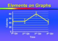
· Use tick marks to show general trends. Use grid lines to stress exact values. Figs. 19 and 20 illustrate the above points, with Fig. 20 being better.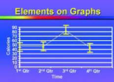
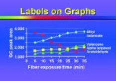
 Placement of Labels
· Place the legends on the bars, lines, wedges of a pie, or the illustration rather than having an actual legend. This avoids double scanning involved in finding a relevant part of the key and then referring to the graphic. If a key is used, put it within the picture area of the graph. Avoid enclosing the key in a box.
· Labels should run horizontally from left to right whenever possible, except for the Y-axis label. A vertical Y-axis label saves space. Vertical text is harder to read so make it large and simple enough to read when rotated. Place axis labels outside the graph. Center the X-axis label under the X axis. Center the Y-axis label parallel to the Y axis. Parallel labels should read from bottom to top.
· Axis labels should be placed close to the scale numbers, but not so close that they protrude into the imaginary rectangle occupied by the scale numbers.
· If there is more than one Y axis, the labels should all read in the same direction (from bottom to top). It is helpful to include the data point or line pattern in the Y-axis labels to show which data relate to which Y axis.
· Numbers along the Y axis should be horizontal and aligned on the decimal point, whether or not the decimal point is actually present.
Figs. 21 and 22 compare the incorrect (Fig. 21) and correct (Fig. 22) usage of label placement. 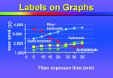
--- PAGE BREAK ---
 Size of Labels
· The axis label should be large enough to be legible but not so large or heavy that it competes with the chart content for attention. Numbers should be smaller than the axis label size. The title should be larger than the axis labels. Explanatory labels, such as a legend, should be smaller than the axis labels.
· Boldfacing or increasing the text size of the headings can help to differentiate them from the body of the table. Use larger font sizes instead of boldface text.
· For posters, text needs to be large enough so that the audience can read it comfortably from 2 meters away. Labels should be set in at least 18-point text, upper- and lowercase. Use generous leading on multiline blocks of text.
Amount of Labeling
· Use no more than 5–7 words on an average chart axis.
· For multichart formats or composite figures that share a common X or Y axis, eliminate any redundant axis labeling (Fig. 23). 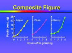
Label Content
· Spell out as many of the labels as possible, but be brief. Too many obscure abbreviations and mysterious codes are distracting. Standard abbreviations can be used to keep axis labels short (e.g., % for percentage).
· Axis labels should include both the name of the variable and the unit of measurement. Conventionally, the name of the variable is given first, then the unit of measurement is given immediately next to or below it in parentheses.
· Use units that are complete and easily understood.
Label Style
· Use upper- and lowercase lettering.
· Use sans serif typefaces, such as Helvetica, for all labeling and text.
Tables and Charts
Charts are used to organize numeric or other data without graphic plotting or interpretation, except in the arrangement of numbers in columns and rows. Charts are best used to emphasize actual measured values or a small data set. Large or complex tables are appropriate for print media but are ineffective in slide shows, computer shows, or video graphics. A table must be understandable and complete without detailed reference to the text.
· Line up decimal places, note units clearly, and construct clean, orderly arrangements of rows and columns.
· Highlight important numbers or words by changing the color or size.
· Round-off numbers.
· Keep row and column headings brief.
· Keep enough space between columns so they are seen as separate from one another. The space should be the minimum necessary for clear visual separation, and it should be consistent.Vertical rules make it difficult to read across rows. Horizontal rules help with reading across the table.
--- PAGE BREAK ---
Error Bars
· Caps on error bars should match the diameter of the data point markers or symbols.
· Lines used for error bars should be thicker than lines used for the grid or frame but thinner than those used for data lines.
Grid Lines and Tick Marks
· Tick marks are used to identify the type of scale, not to identify each data point. They should be long enough to be visible but not obtrusive.
· Tick marks on a linear scale should be the same length.
· Don’t label every tick mark, or the axis will look too cluttered. Number at conventional intervals, e.g., 0, 2, 4, 6, 8, etc.
· Tick marks at the beginning of each logarithmic cycle should be longer than the others.Only tick marks at the beginning of cycles in logarithmic cycles should be numbered.
· Each axis should end at a tick mark.
· Tick marks can point in or out, but they should not cross the axis. Tick marks that point in direct the eye toward the data. Tick marks that point out keep the face of the graph clear and are particularly useful when data fall on the axis.
Special Effects
· Avoid special effects if they do not enhance the point to be made.
· Use of 3-dimensional bars may make reading the data a little more difficult because it is not evident which part of the 3-D bar measures actual data.
· Use 3-D graphs if you have three axes of information.
· Build a series on a 2-D version of the chart to add some distinctive effect (Figs. 24 and 25).
 · Consider breaking the graph or figure into components (i.e., add segments, build, or use more slides to show the graph).
· You can show the entire graph and then focus in on a certain part that really displays the information you want to get across.
Bar Charts
Bar charts are used to compare an amount of a variable at particular times or points, or to compare the amount of one variable to another. Bar charts are less effective in emphasizing the trend in a variable over time. They may be horizontally or vertically oriented. The virtue of bar charts is their simplicity, so they should be as uncluttered as possible.
· Use as few bars as necessary, with a maximum of six different bars.
· Emphasize one aspect of the data by changing a specific bar’s color or texture.
· Leave control bars unfilled (or white on color charts) to stand apart from experimental variables.
· Bars should be wider than the spaces between them. All bars should be of equal width, and all spaces—including the space between the axis and the first bar—should be of equal width. Bars should be neither very thin nor very wide.
--- PAGE BREAK ---
· With groups of bars, a space should separate the groups, but no space is necessary between the bars of a group. The space between the groups of bars should be about the width of one bar or less.
· Data values should not be written either within the bar or outside it. If exact values are important, the data should be presented as a table. If bars are labeled with values, don’t use tick marks or grid lines.
· Don’t use tick marks on the X axis.
· Use the same fill color for all bars in single data set.
· Use different fill colors for positive and negative values.
· For single bars, center labels below each bar.
· For groups of bars, individual bars can be labeled. Group labels can be centered below the individual bar labels for vertical bar charts or placed to the left of the individual bar labels for horizontal bar charts. The groups can be labeled, and the bars can be distinguished by shading or patterns. Lettering in individual column labels should be smaller than lettering in the group labels.
· The longest bar (or its error bar) should reach nearly to the end of the chart. Figs. 26 and 27 illustrate the above points. They show basically the same information, but Fig. 27 is easier to read.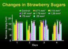
 Cluster or Segmented Bar Charts
· Use five or fewer segments per bar or bars per cluster.
· Use darkest or densest fills for segments at baseline (or left side) and lighter fills as segments rise up the bar (or move to the right).
· Display values over, next to, or inside tops of bars when precise values are significant.
· Add connecting lines between bar segments to facilitate comparisons.
Line Graphs
Line graphs are used to portray continuous movement or change in a measured variable, typically against a time scale. They are best for showing the trend in a set of data over time, but are less effective in comparing amounts of two variables.
· Five or six lines on one graph are usually plenty. The number that can be presented clearly on one graph depends on the position of the curves and the function of the graph.
· Use thick, solid, colored lines for projection and patterned lines for black-and-white printouts
· Use a different color for each line,making the most important line the lightest and brightest color.
· Data lines should be the heaviest lines on the graph.
· Data points should always stand out from and dominate the connecting line-work, since the data points are the actual data and the connecting lines are usually just a visual device to show trends and continuity.
· Symbols and connecting lines should dominate all other elements of a chart.
· Symbol diameter should be about two to three times the width of any connecting lines.
--- PAGE BREAK ---
· Polygon symbols should be used as markers or symbols. Recommended symbols are filled circle, triangle, and square, and open circle, triangle, and square. Other symbols are not as distinctive and, if used, should be carefully oriented, so that they can be distinguished from the recommended ones and from the connecting line. Avoid using X’s, crosses, or symbols with dots.
· For data points that overlap, the symbols should be drawn overlapped.
· All symbols should look the same size.
· Curves should not extend before the first data point or after the last data point.
· Identify curves with a brief label next to them. Place the label close to the curve. It should be contained within the rectangle implied by the axes and should be oriented horizontally.
· Don’t use arrow or leader lines, as they clutter the graph. Figs. 28 and 29 illustrate the above points, with Fig. 29 being better.
 Pie Charts or Stacked Bar Charts (Component Bar Charts)
Pie charts illustrate the component parts or percentages of a whole, where the values must add up to 100%. Pie charts are the least efficient means of charting small data sets and are not often used in the sciences, but are common in business and general information graphics.
Stacked bars are often used as space-efficient replacements for multiple pie charts. Neither pie charts nor stacked bar charts are impressive if too many elements are displayed. About six segments would be the limit before visual confusion sets in.
· Use a maximum of six slices in a pie chart. If you need more, group smaller ones into one group titled “miscellaneous” or “other,” and pull this group out into another chart.
· Order slices beginning with the largest slice or the most important data starting at the 12 o’clock position and arrange subsequent slices clockwise. The most important slice is in the upper-right quadrant. Arrange slices in order from largest to smallest, clockwise.
· Emphasize one slice by “exploding it” or moving it out of the circle. You can also choose a color or fill pattern different from the rest of the slices to emphasize a particular slice.
· For stacked bar charts, labels are placed to the right of the vertical graph or above a horizontal graph.
· For pie charts, labels are placed inside the segments if the labels are brief and segments are large enough. Otherwise, labels are listed next to the segment. Labels should either be in or out of the chart; don’t mix label styles (Figs 30 and 31).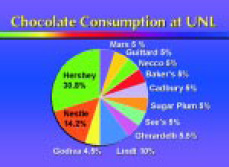
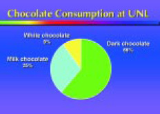 · Percentages should be included in labels. Use whole numbers.
· Percentages are usually separated from the labels (on a separate line) and are smaller in size than the labels.
· Labels and percentages should be placed horizontally, not at an angle
· Each slice should be easily distinguishable from the rest and clearly labeled.
--- PAGE BREAK ---
Area Charts
Area charts emphasize the volume of data, from the baseline of a chart to the top of a trend line. There are two types of area charts, cumulative and stacked:
· Cumulative charts consist of lines on a multiline chart with the areas beneath each line shaded. Each line is measured from the baseline.
· Stacked charts also show several data sets, but each area is measured from the previous area. Areas do not share a common baseline. Because they don’t share a baseline, order of the areas can radically affect the look and meaning of the chart.
· The area that is to be emphasized should be placed along the baseline. There it is most prominent, and it is easiest to judge the size of the area with the flat baseline. The smoothest band (the one with the least variation) can also be placed at the bottom of the chart, and so on up to the top.
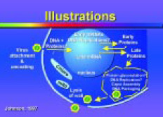
Diagrams
Diagrams are graphic attempts to simplify and explain the relationships of component parts or stages of a process or structure (Fig. 32). 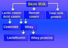
· Emphasize the flow of processes over time, or depict a hierarchical order of relationships.
· Within the diagram, make labels compact to conserve space.
Textures and Patterns
· Make sure textures and patterns don’t interfere with seeing and understanding the message.
· Text on top of textures or patterns can be extremely difficult to see in projected materials.
· Do not use patterns (such as crosshatching) using two different colors for projected visuals. These patterns should be used for differentiation of different areas for black-and-white reproduction only. Use solid or shaded blocks of color instead.
Pictures (Photographs, Illustrations, and Clipart)
· For posters, graphics should be done on matte-surfaced paper to reduce glare from overhead lights.
· Graphics prepared for the printed page rarely make good visuals for presentation. Images usually need to be simplified. Text needs to be made larger so an audience can read and understand the graphic as quickly as possible.
· Photographs and illustrations should be close-ups so detail can be seen.
Drop Shadows
Drop shadows are shadows behind your text and graphics. They visually imply that foreground objects are “floating” above a flat background. They can make visuals more legible, particularly text.
· Keep the shadows close to the graphic, so they don’t appear as separate graphics.
· Always make drop shadows darker than your background.
· Never use drop shadows on overhead transparencies.
--- PAGE BREAK ---
Room Lighting Conditions
· Room lighting conditions vary. If there is light on the screen, kill it, unscrew it, or cover it. For example, unscrew ceiling bulbs or spotlights from above the screens.
· Move or angle the podium so the speaker’s light doesn’t show or reflect on the screen.
Visual Pacing
· Repeat your title slide at the end. This should include authors’ names, and your e-mail address.
Acknowledgments
· Acknowledge the source of a graph, data, or graphic.
· Only include the author and year of publication on the visual. Presenters often put in too much reference information, and this clutters the visual. Figs. 33 and 34, respectively, illustrate the correct and incorrect presentation of references. Fig. 34 is typical of the slides presented at a professional meeting. 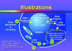
 Three Things to Remember
Simplicity is not simple!
Visual communication means thinking visually.
Visuals support your presentation and information.
by James W. King, Lana K. Johnson, and John H. Rupnow
Author King is Associate Professor, Agricultural Leadership, Education and Communication; author Johnson is Graphic Specialist, Communication and Information Technology; and author Rupnow, a Professional Member of IFT, is Professor, Food Science and Technology; University of Nebraska-Lincoln, 353 FIC, Lincoln, NE 68583-0919. Send reprint requests to author Rupnow.
Sources for Further Information
Briscoe, M.H. 1996. “Preparing Scientific Illustrations, A Guide to Better Posters, Presentations and Publications.” Springer-Verlag, New York.
Davis, M. 1997. “Scientific Papers and Presentations.”Academic Press, San Diego.
Day, R.A. 1994. “How to Write and Publish a Scientific Paper,” 4th ed. Oryx Press, Phoenix, Ariz.
Hodges, E.R.S. 1989. “The Guild Handbook of Scientific Illustration.” Van Nostrand Reinhold, New York.
Johns, M. 1995. Design for slides. J. Audiovisual Media in Medicine 18(3): 121-128.
King, J.W. and Rupnow, J. 1993. A primer on using visuals in technical presentations. Food Technol. 46(5): 157-158, 160, 165-168, 170.
Kosslyn, S.M. 1994. “Elements of Graph Design.” W.H. Freeman, New York.
Rabb, M.Y. 1993. “The Presentation Design Book : Tips, Techniques & Advice for Creating Effective, Attractive Slides, Overheads, Multimedia Presentations, Screen Shows.” Ventana Press, Inc., Chapel Hill, N.C.
Rupnow, J. and King, J.W. A primer on preparing posters for technical presentations. Food Technol. 49(11): 93-94, 96, 98-102.
CBE. 1988. “Illustrating Science. Standards for Publication.” Scientific Illustration Committee, Council of Biology Editors, Bethesda, Md.
Simmonds, D. and Reynolds, L. 1989. “Computer Presentation of Data in Science.” Kluwer Academic Publishers, Norwell, Mass.
Tufte, E.R. 1990. “Envisioning Information.” Graphics Press, Cheshire, Conn.
Tufte, E.R. 1983. “The Visual Display of Quantitative Information.” Graphics Press, Cheshire, Conn.
Tufte, E.R. 1997. “Visual Explanations: Images and Quantities, Evidence and Narrative.” Graphics Press., Cheshire, Conn.
White, J.V. 1974. “By Design. Word-and-Picture Communication for Editors and Designers.” R.R. Bowker, New York.
White, J.V. 1984. “Using Charts and Graphs, 1000 Ideas for Visual Persuasion.” R.R. Bowker, New York.
Wileman, R.E. 1979. “Exercises in Visual Thinking.” Hastings House Publishers, New York.
Wileman, R.E. 1993. “Visual Communicating.” Educational Technology Publications, Englewood Cliffs, N.J.
Edited by Neil H. Mermelstein
Senior Editor